Cork House
Waltham Forest

Project Details
£100,000 to £249,999
Alteration to existing property
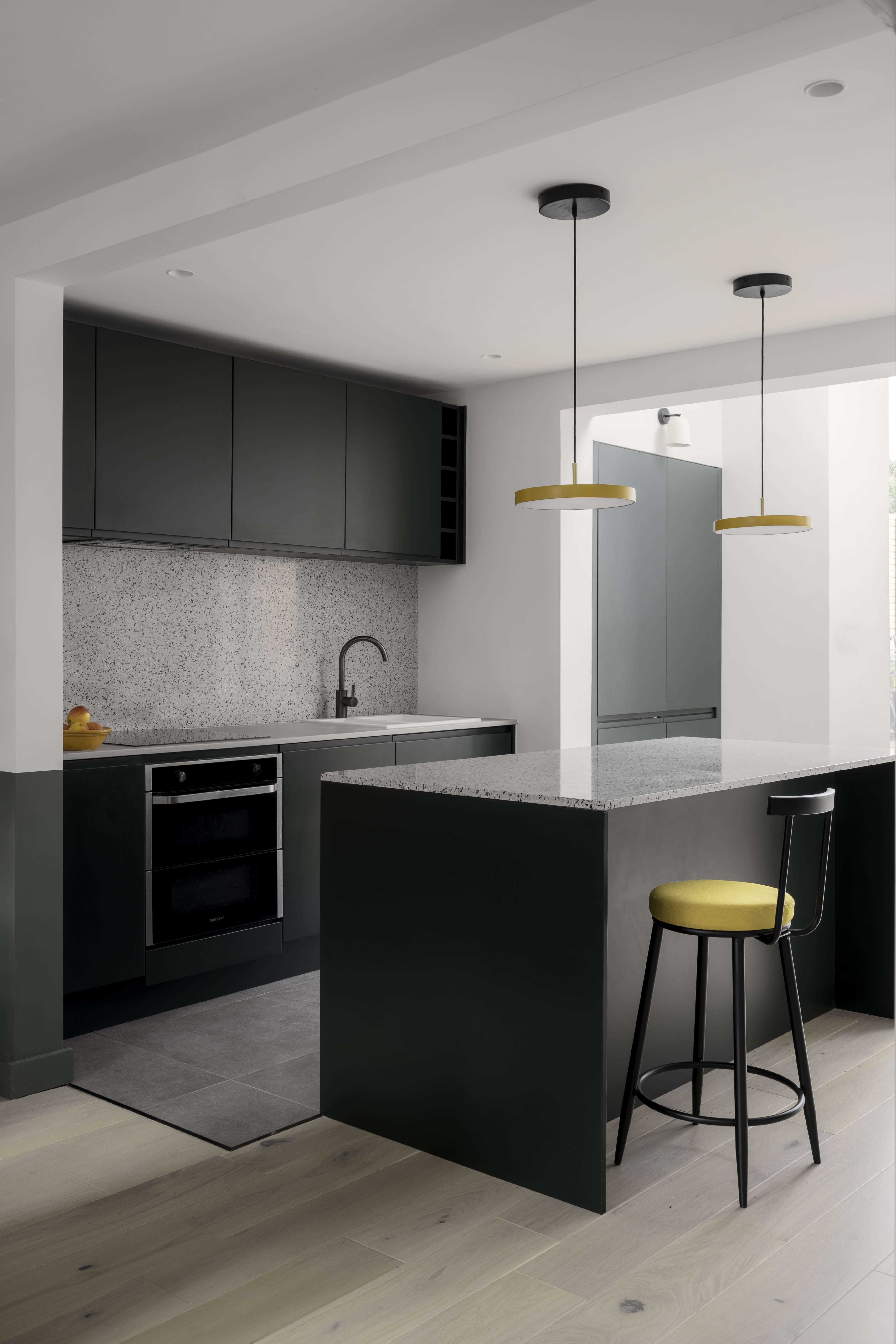
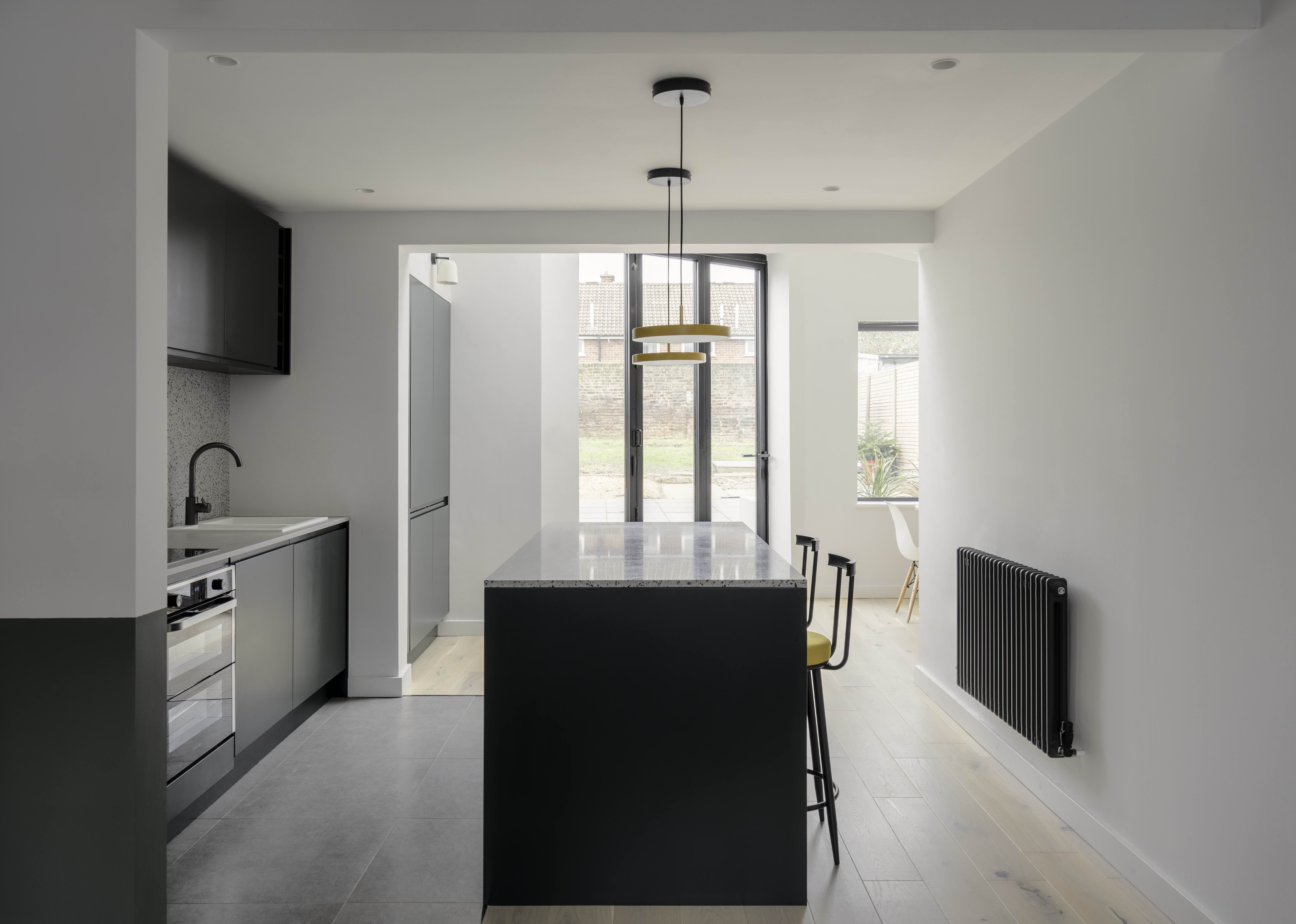
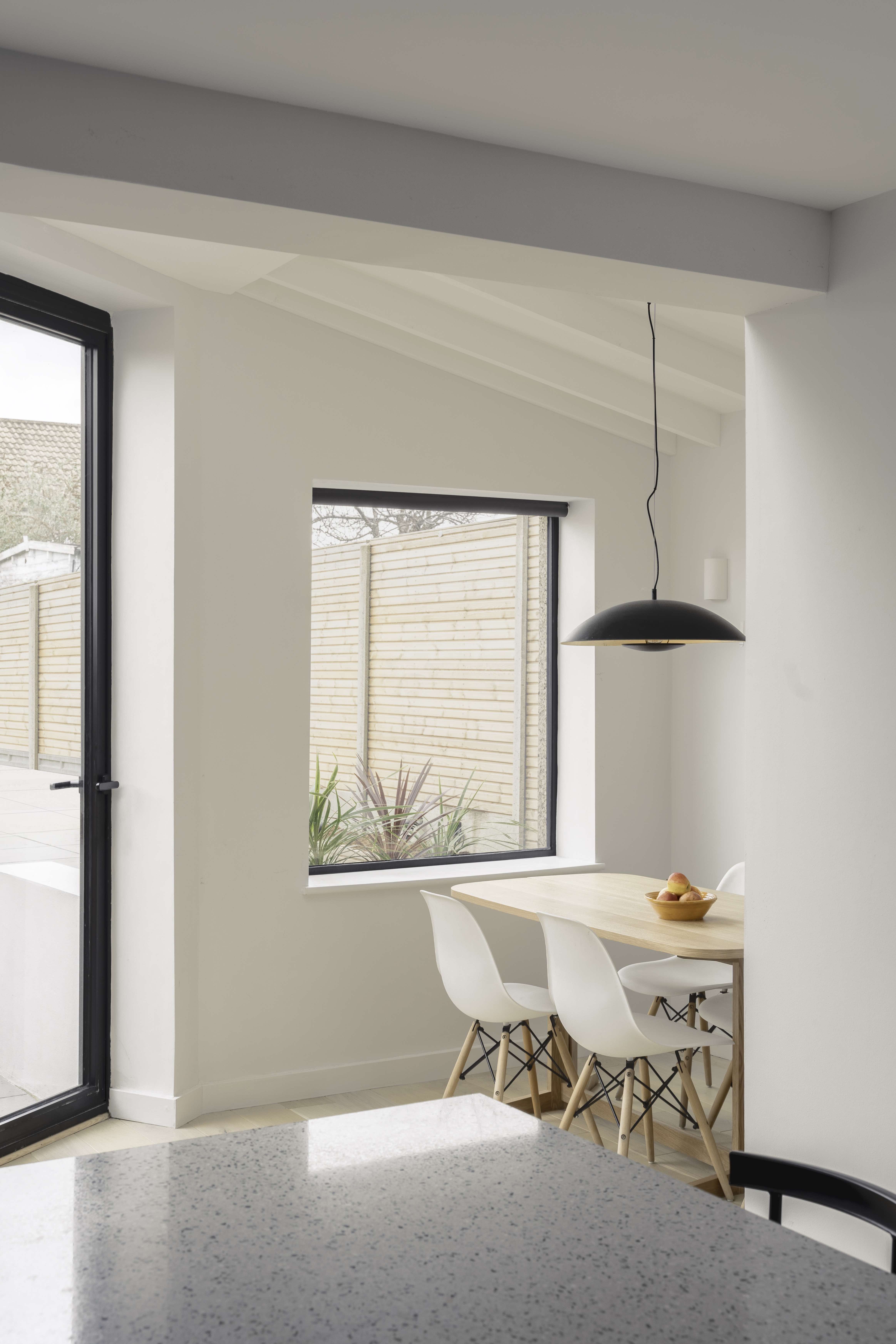
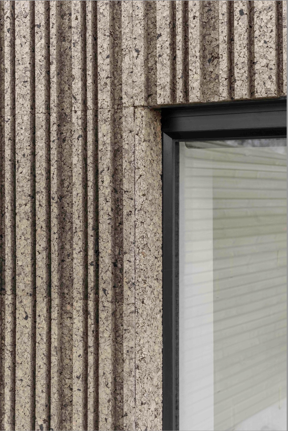
The project brief was to assist our client with the reconfiguration of the layout and design of a new rear ground floor extension, that would allow the property to gain the best amount of natural light and quality of space for this north facing plot. The client was keen to have a contemporary, yet sensitive extension that maximised site conditions and addressed landscape and boundary height restrictions in a clever way. This brought about the idea of an asymmetric pitched roof and angled extension that could overcome orientation restrictions. By introducing and angled stepped facade with large amounts of glazing and a large opening doors, a fixed picture window and a skylight overhead the design now allows for a generous amount of natural light to flow through. The homeowner’s brief brief included achieving a functional open plan kitchen/dining and living area within the small plot. Compact yet functional and interesting in its material use and spatial qualities, the extension adds character to the terraced house and local context, by means of introducing a playful and unusual rear extension. In order to maximise internal headroom, and to incorporate the difference in level between gardens, we proposed to intervene by adding an asymmetric pitch that would maximise ceiling height maintaining required boundary restrictions. We chose to clad the extension in something a little different a dark patterned cork, in order to use a sustainable and test something new seen less often in the local context. We wanted a material that had natural variation and would sit well against the existing brick and clay tile roof backdrop. With the geometry, shape, detailing and material choice we also wanted to acknowledge the contemporary nature of this addition to the house, by using a material distinctly different from the ones found in the host building. Internally we wanted to keep the rooms feeling bright yet practical, adding some character throughout the spaces by introducing a touch of signature colour and vibrancy to the design. The use of off white green and yellow throughout unifies the room by making the spaces read as one, despite the numerous different uses found in an open plan arrangement. The extension adds essential but interesting space to the property. It successfully feels bright and open and draws light through deep into the plan.


